Microsoft Purview
Product designer for Microsoft's enterprise data security, governance, and compliance platform. My work spanned across Purview's solution areas including Data Loss Prevention, Information Protection, Data Security Posture Management, Settings, and more. Partnered with PMs and Engineering through the end-to-end product lifecycle to deliver multiple features including AI agent skills, reporting dashboards, complex configuration flows, settings redesigns, and more to help security admins complete their daily tasks with ease.
A note on confidentiality: Not all of the designs and work from this project can be shared publicly. If you'd like to learn more, feel free to email me.
What I do on Purview
Microsoft Purview is a unified data governance and risk management platform that helps organizations discover, classify, protect, and manage data across on-premises, multi-cloud, and SaaS environments. Built for security and compliance teams, Purview consolidates data lineage, risk assessment, and governance workflows into a single control plane, enabling enterprises to meet regulatory requirements, mitigate data risks, and maintain visibility into their data estate.
As a product designer on the Security UX team, my role spans multiple solution areas across the platform, from DLP and Information Protection to data discovery and settings. I collaborate closely with product managers and engineering to reduce cognitive load in complex workflows, surface actionable insights for security admins under time pressure, and architect flows that balance power-user depth with accessibility for new users. The challenge is designing for a nuanced audience: security professionals who need precise control, compliance officers who need auditable clarity, and IT admins who need operational efficiency, all within a dense, data-heavy product.
Work within Purview
A selection of projects from my time on Purview. More projects are on the way soon!
Purview Service Health
A centralized Service Health dashboard for Microsoft Purview that gives security admins a single place to monitor the health of their data estate. It surfaces real-time status across Purview solutions, Microsoft 365, and Azure Cloud Services, so admins no longer have to switch between portals to stay ahead of issues.
Read more about Service HealthTo monitor the services they relied on, security admins had to jump between separate portals: one for Purview, another for Microsoft 365, and another for Azure. There was no single place to see whether an issue in a connected service was affecting their Purview operations, which slowed issue detection and added friction to daily workflows. Closing this visibility gap had become a top customer ask.
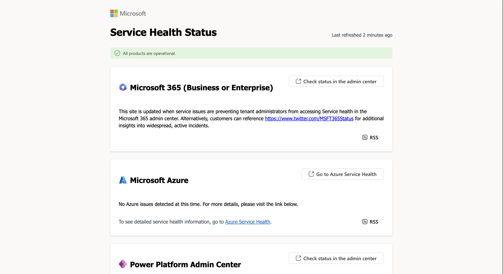
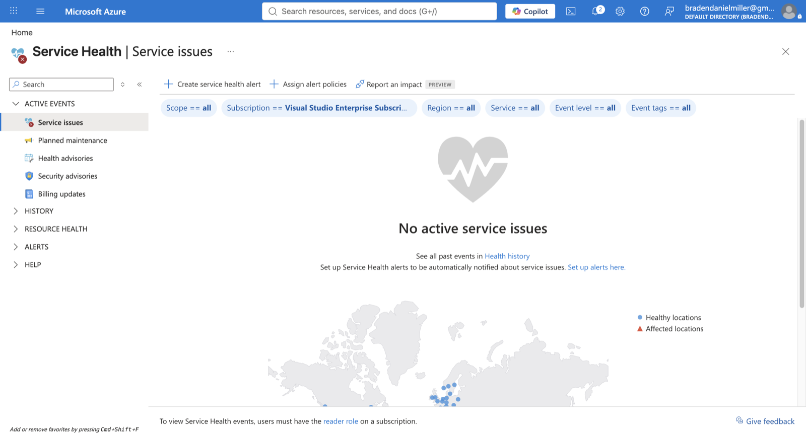
This feature would roll out in phases, with an MVP delivery target of three months. The dashboard needed to unify service health visibility across three critical areas: Purview solutions, Microsoft 365, and Azure Cloud Services. Core requirements included surfacing active issues, historical data, reported incidents, monitoring status, and planned maintenance windows. The core challenge was designing a unified view that gave admins immediate visibility into their entire ecosystem without overwhelming them with noise.
I started by understanding the problem and requirements, then audited the product for similar dashboard experiences, patterns, and components. From there, I designed the first iteration around the MVP and refined it through rounds of feedback from the PM. To ship it, I partnered with an intern front-end engineer, handing off the designs and onboarding them into our design system components and assets.
- 01
Empathize
Mapped how admins chased issues across three separate portals.
- 02
Ideate
Audited existing Purview dashboards for patterns to build on.
- 03
Design
Designed the MVP: active issues, history, and monitoring.
- 04
Test
Pressure-tested the flows through rounds of PM feedback.
- 05
Iterate
Refined and handed off to an engineer and the design system.
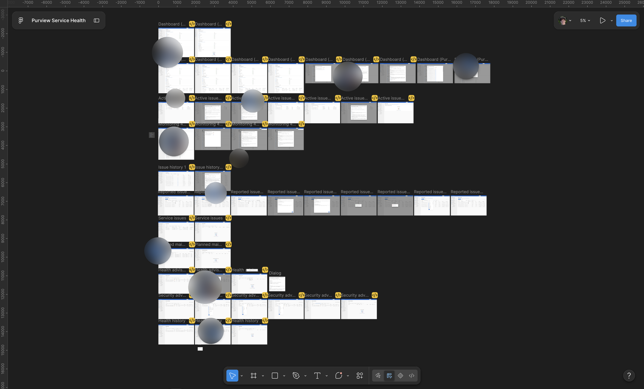
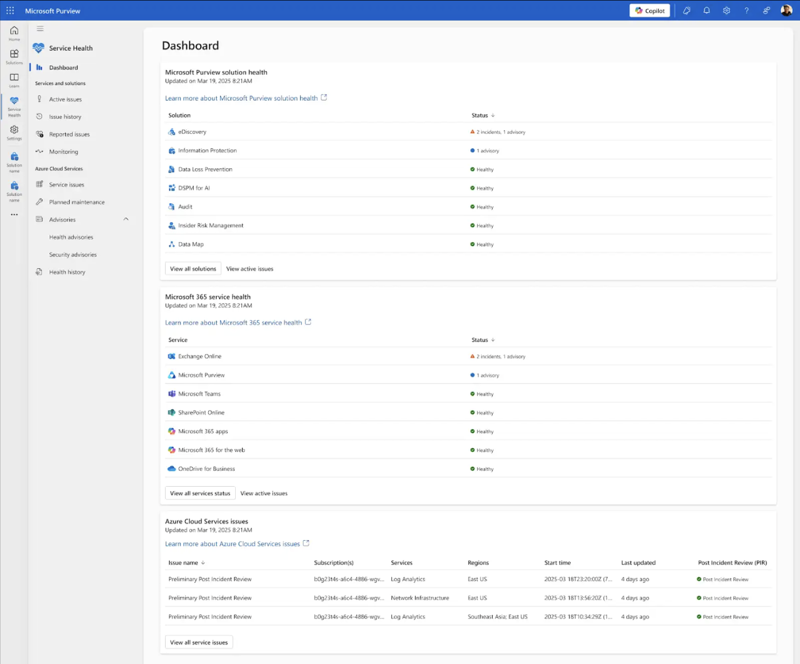
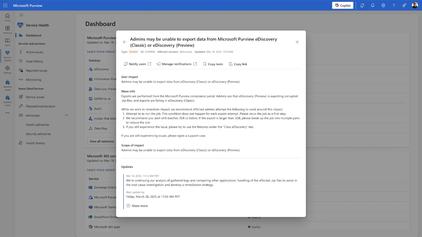
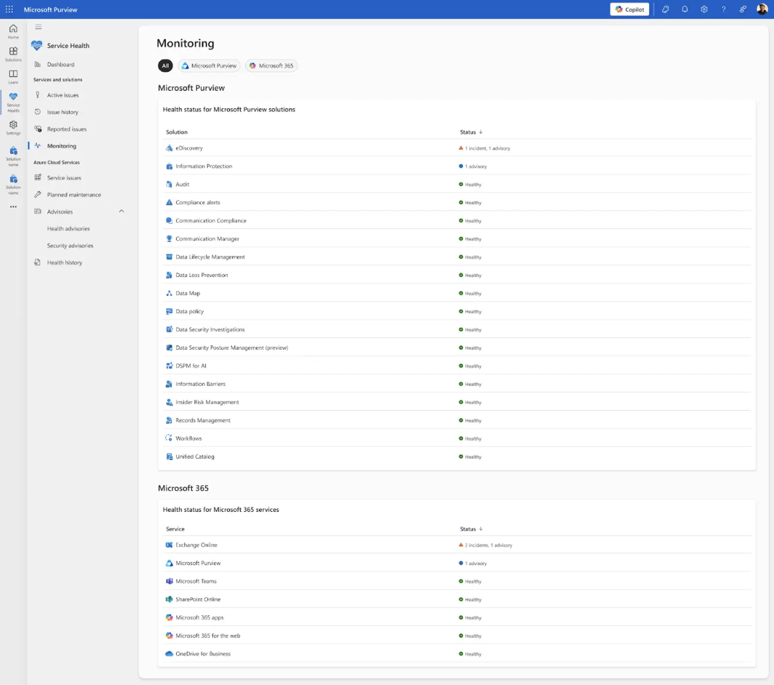
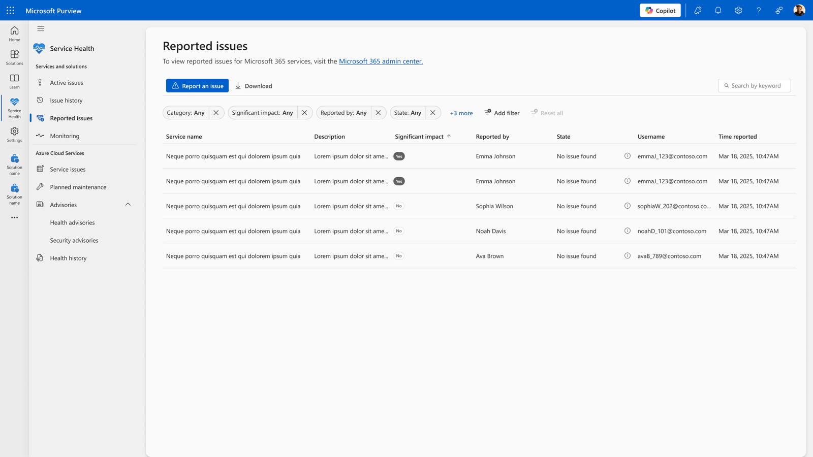
The Service Health dashboard is planned for general availability worldwide, rolling out to customers in fall 2026, and will be enabled by default with no setup required. It brings real-time status for Purview solutions, Microsoft 365, and Azure Cloud Services into a single view, alongside issue summaries, reported issues, and a way to flag emerging problems for Microsoft's support teams to review. Rather than switching between portals, admins will be able to view and triage service issues from one place, giving them clearer visibility across every service their Purview environment depends on.
Device Health Reports
A device health reporting dashboard that gives security and compliance admins a single, centralized view of how ready their devices are for Endpoint Data Loss Prevention. It brings onboarding status, policy update readiness, connectivity, and feature readiness together in one place, so admins can find at-risk or misconfigured devices without troubleshooting across multiple pages.
Read more about Device Health ReportsCompliance and security administrators had no single place to understand whether their devices were actually ready to receive and enforce Endpoint DLP policies. Confirming onboarding status, checking Microsoft Defender Antivirus versions, tracking which devices had gone offline, and validating feature readiness all lived in different places, which meant slow, manual troubleshooting whenever something looked off. Admins needed one view that could tell them, at a glance, which devices were healthy and which needed attention.
The device page was carried over from a legacy portal, so what it could surface was largely fixed before design started. The dashboard reads from devices that reported in the last 30 days and refreshes hourly, which means it describes posture rather than live state. Devices also have to be onboarded to Endpoint DLP and actively reporting telemetry to appear at all. Those three limits decided which signals were worth showing, and how confidently any of them could be phrased.
Rather than wait for a full rebuild, we scoped an MVP around the highest-value signals we could reliably surface and planned a phased rollout, shipping the core reporting first and layering in additional readiness signals and features over later phases. The design challenge was giving admins immediate, trustworthy visibility into device health within those limits, without implying more precision than the data could support.
I started by understanding the problem, the requirements, and the limits of the legacy data, then audited the product for existing dashboard patterns, components, and reporting experiences so the new dashboard would feel consistent with the rest of Purview. From there I designed the first iteration around the MVP and refined it through rounds of feedback with the PM, prioritizing which signals earned a place on the page. To ship it, I partnered with engineering on handoff, mapping the designs onto our design system components and assets.
- 01
Empathize
Learned which device signals admins actually needed.
- 02
Ideate
Audited Purview's reporting patterns within the legacy limits.
- 03
Design
Designed the MVP around the most reliable signals.
- 04
Test
Pressure-tested each signal against what the telemetry could support.
- 05
Iterate
Refined and handed off to engineering for phased delivery.
Signals at risk, not signals confirmed
The telemetry could tell us a device looked unreachable or out of date. It could not tell us a policy had actually failed to land. Reporting failures would have been the stronger number and the wrong one, so every indicator is phrased as risk rather than outcome. Microsoft's own documentation carries the same framing: the indicators "don't confirm whether a device failed to receive a policy update, but instead highlight devices that may be at risk of not receiving future updates."
Buckets that never double count
Last seen is grouped into separate, non-cumulative buckets, and each device is counted only once, in the most recent bucket that applies. Overlapping ranges would have read as more devices than the customer actually has, and an admin triaging an incident is exactly the person who cannot afford to add up their own fleet twice.
Ship on the legacy data rather than wait for the rebuild
Waiting for a modernized device page would have meant no visibility at all for the length of that rebuild. Shipping on what the legacy source could support meant a narrower dashboard sooner, with the room to widen it as later phases landed.
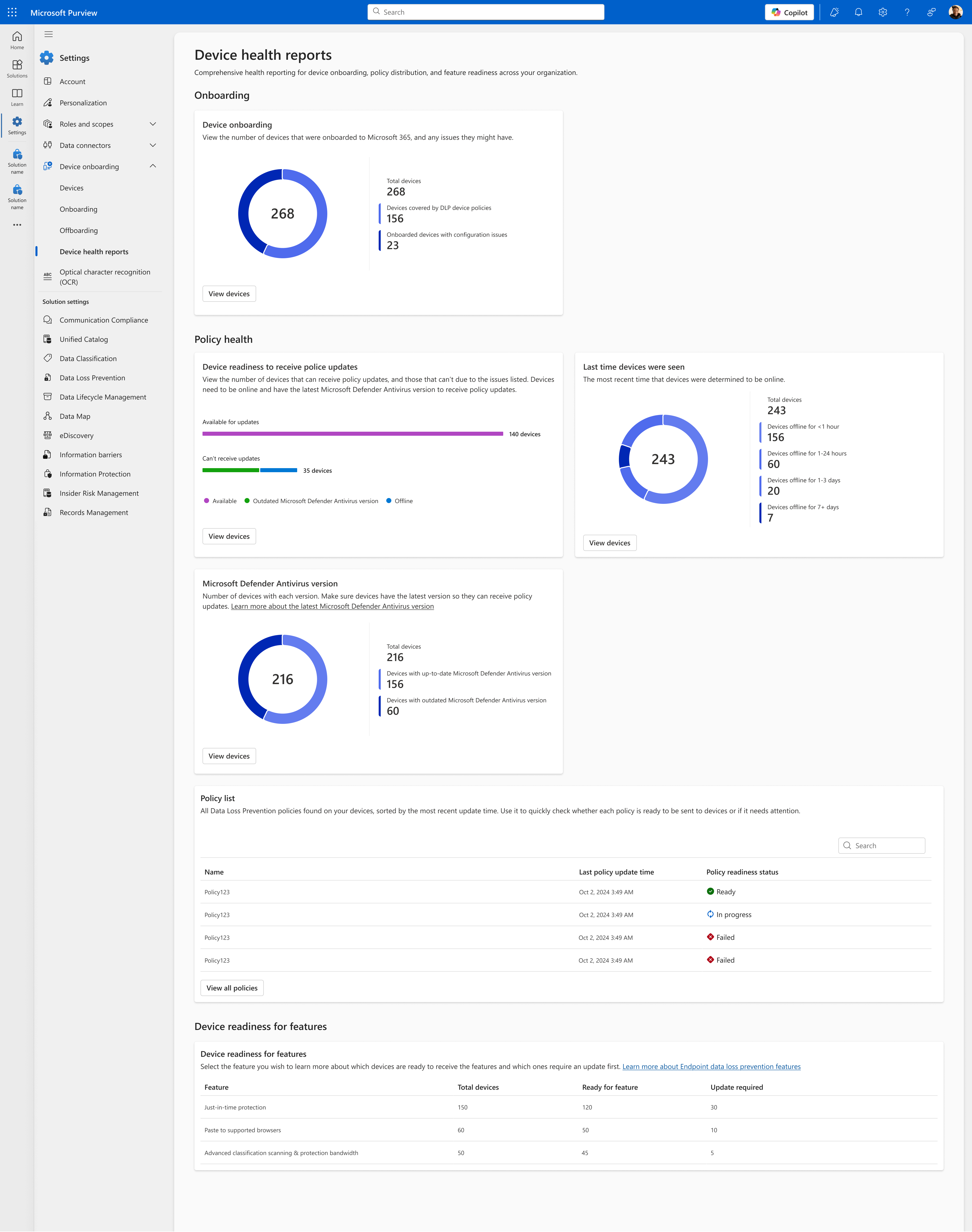
The dashboard consolidates device health into a single view: onboarding coverage, device readiness to receive policy updates, when devices were last seen online, Microsoft Defender Antivirus versions, a policy readiness list, and per-feature readiness for capabilities like just-in-time protection and paste to supported browsers. Delivered in phases starting with the MVP, it gives admins one place to monitor device posture at scale, catch misconfigured or at-risk devices early, and validate readiness before rolling out new Endpoint DLP policies or features.